Case study — packaging

Eleven specs, one panel, zero clutter

Retail carton design for the Corvid 4MP ColorHunter — a security camera sold to installers who compare spec sheets before they compare brands.

ClientCorvid
CategorySecurity hardware
ScopeRetail carton
MarketUnited States
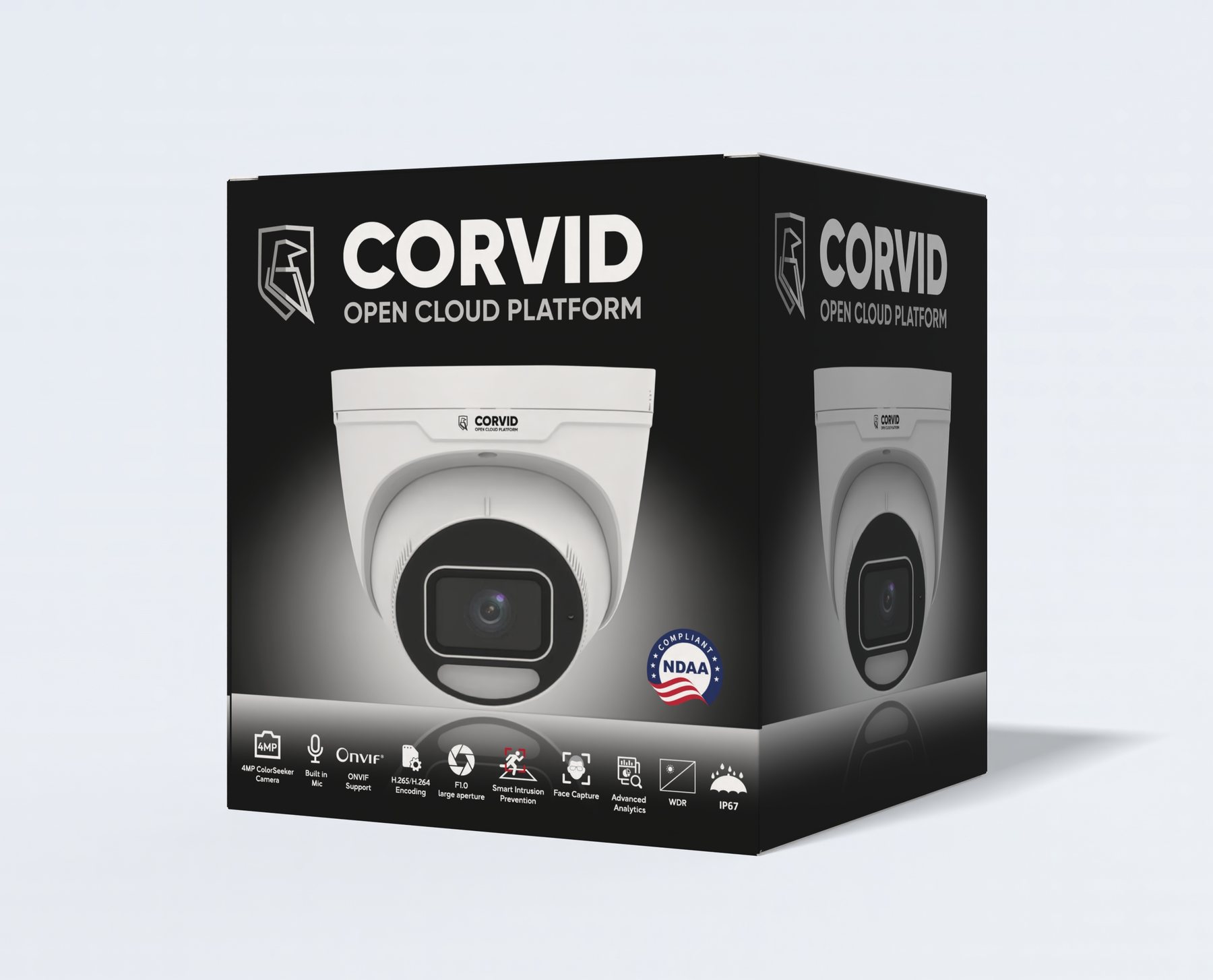
Corvid 4MP ColorHunter retail box, front and side panel

Final carton — front and side panel

The brief

A box that has to argue

Corvid sells into the CCTV and access-control channel, where the person picking the box off the shelf is usually an installer, not a homeowner. They already know what they need. What they don't know is whether this particular camera clears their checklist.

So the packaging isn't decoration — it's the spec sheet. It has to answer eleven separate technical questions in the few seconds someone spends holding it, and still look like a brand worth trusting with a building's security.

The problem

Three things fighting each other

01

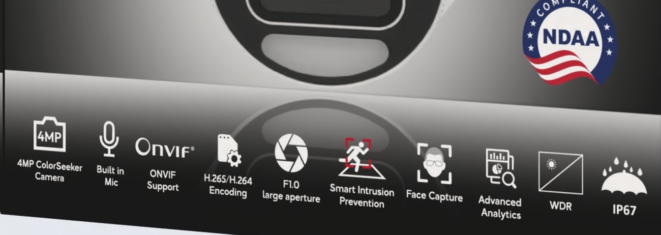
Eleven features had to fit on one panel — 4MP ColorSeeker, built-in mic, ONVIF, H.265/H.264, F1.0 aperture, intrusion prevention, face capture, analytics, WDR, IP67. Listed as text, it reads like a manual.

02

NDAA compliance is the single biggest buying trigger in this market. Bury it in a feature list and you lose the sale to the box that shouts it.

03

These boxes get stacked on warehouse shelving. If only the front panel is designed, half the stock is unidentifiable from the aisle.

The approach

Four decisions that did most of the work

Decision 01

Black ground, lit product

The camera is white. Putting it on a black carton with a soft light bloom behind it means the product reads as the brightest thing on the shelf — no border, no badge, no arrow needed. It also gives the whole box a security-equipment feel rather than a consumer-electronics one.
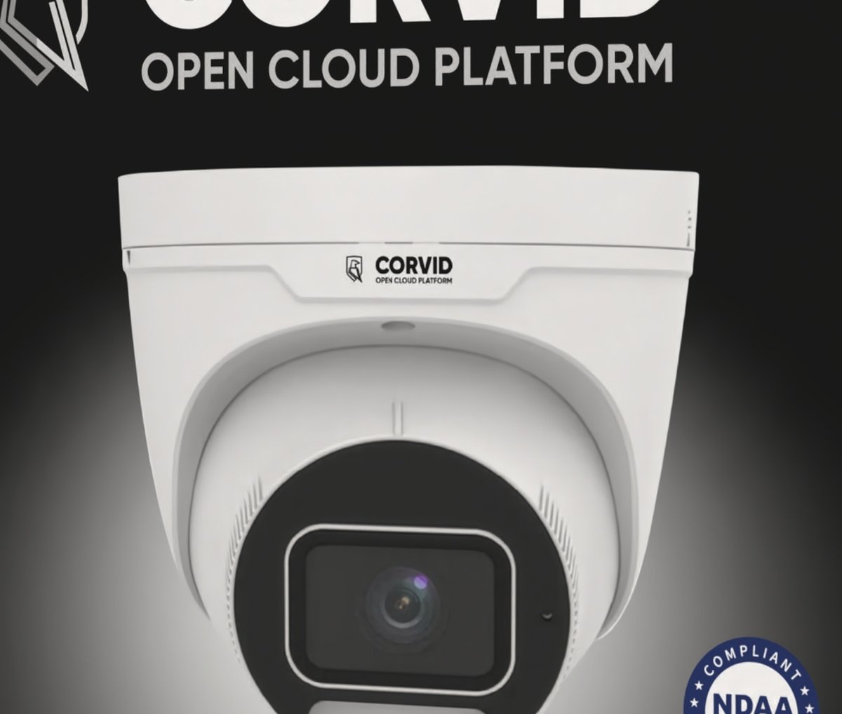

Product hero on black with light bloom
Decision 02

Lockup sized for two metres

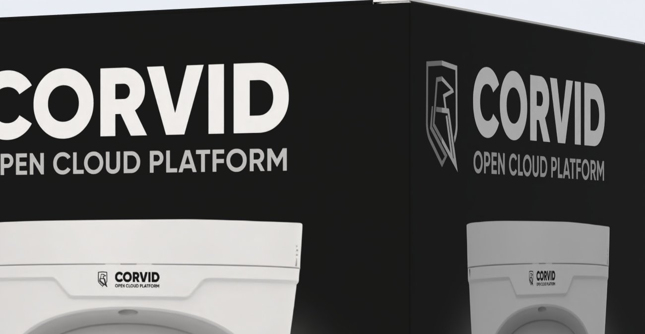
The shield mark and wordmark sit top-left at a size that still resolves from across an aisle, with "Open Cloud Platform" set underneath in a wide, quiet caps line. The mark is drawn in outline so it holds up on black without a knockout box around it.

Corvid shield mark and wordmark lockup
Decision 03

Specs became a footer band, not a list

Every feature got its own icon and a two-line caption, laid out as a single strip across the bottom of the panel. Eleven items scan in about three seconds because the eye moves sideways once instead of reading down. The band also separates cleanly from the product zone, so the top of the box stays calm.

Icon-based specification strip along the bottom of the box
Decision 04

The side panel repeats the front

Rather than filling the side with legal text, it carries the same lockup and product shot at reduced scale. Stacked or shelved sideways, the box still identifies itself — and the NDAA badge keeps its own clear space on the front so nothing crowds the one mark that closes the sale.

Side panel carrying the same lockup and product image
What we delivered

Print-ready, first time

Everything set up on the manufacturer's die-line with correct bleed, safe areas and CMYK build — the artwork went to press without a round of corrections.

  • Die-line setup
  • Front panel artwork
  • Side panel artwork
  • Custom feature icon set
  • Product retouching
  • Print-ready CMYK
  • Bleed & safe areas
  • 3D visual for listings
The result

What it did for the business

$0k

in product revenue for the client since this packaging went live.

"He created a premium packaging design that perfectly matched my vision and made my product look professional and market-ready. The final files were delivered in high quality and ready for production."

Verified client — packaging design

Got a product that deserves a better box?